Whether a picture is genuinely worth 1,000 words is up for debate. But what isn’t debatable is that the average employee wants to spend as little time as possible reviewing and choosing benefits during open enrollment season. You can streamline the process (and earn your employees’ appreciation) by supplementing your benefits guide’s text with easy-to-grasp visualizations.
Why Include Visualizations in Your Employee Benefits Guide
While digital channels such as decision-support tools, microsites, and virtual benefits fairs help modern HR teams expand their education and outreach efforts beyond the printed page, the employee benefits guide remains an open enrollment season staple.
Whether in print or digital form, an employee benefits guide is a reliable one-stop reference for all things related to your company’s benefits package. Employees consult their guides when choosing benefits during open enrollment or onboarding and when they have questions about coverage or using their benefits throughout the year.
Unfortunately, many employee benefits guides suffer from an excess of words—and not much else. All this text may be necessary, especially for employees who want or need to dive into the details of their benefit options, but it can also be discouraging.
As you’re well aware, employees routinely complain that benefits material is dense, jargon laden, and intimidating. Many workers would rather ask for a raise than attempt to understand their benefits.
For better or worse, the average employee spends less than an hour per year choosing benefits. Few have the time or motivation to parse thick blocks of confusing terminology—which is where visualizations can shine.
Graphic design experts learned long ago that a well-placed visual element can relieve the monotony of endless paragraphs and provide quick shortcuts to understanding. Graphics, charts, and diagrams can explain difficult concepts with clarity that purely written content often lacks.
Here are a few tips for enhancing your employee benefits with visual flair:
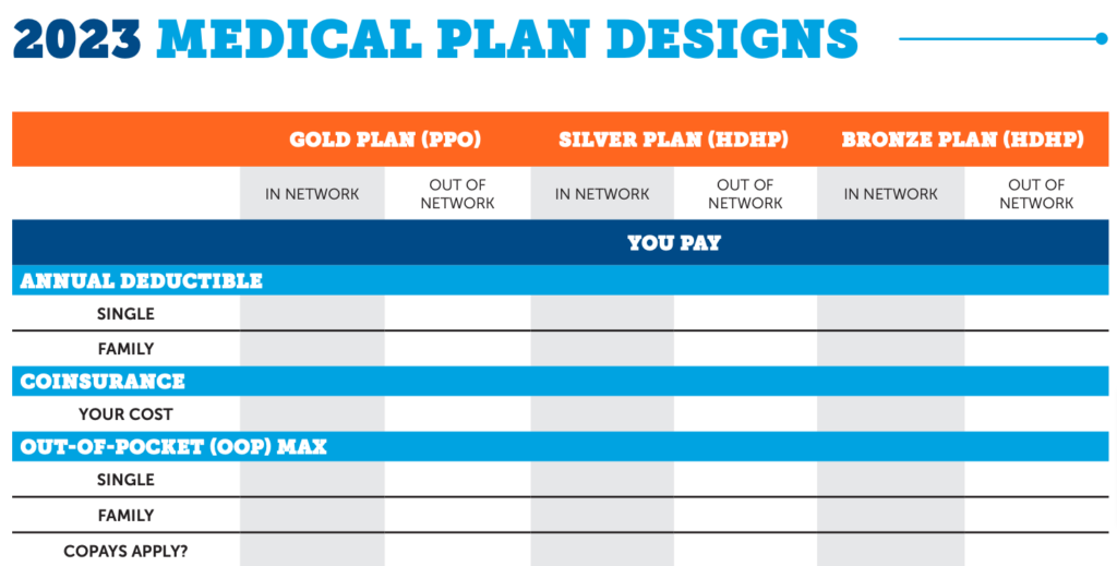
1. Include Tables to Help Employees Quickly Compare Health Plans
For many employees, one of the most frustrating aspects of choosing benefits is determining how plans differ, especially in terms of cost and coverage. Because plans often come from different providers, one-to-one comparisons are not always easy.
Comparison tables can make the differences between plans apparent at a glance by highlighting essential details such as copays, network size, and deductibles and placing them side by side (similar to the tables you’ll see comparing product specs on shopping sites).
2. Help Employees Envision Cost Savings Over Time
Speaking of frustrations, for many HR team members, the most frustrating aspect of open enrollment is the difficulty of communicating the value of high-deductible health plans (HDHPs) and health savings accounts (HSAs).
As an HR professional, you know these plans can often significantly reduce your employees’ (and your organization’s) healthcare spending. Nevertheless, employees often shy away from them, fearful of the term “high deductible.”
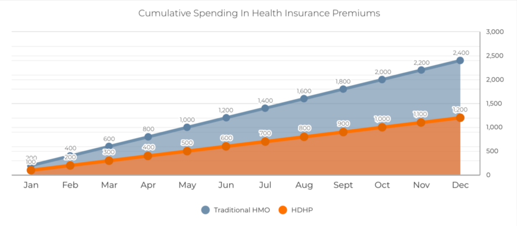
The right visualization can demonstrate to employees that not only are HDHPs not something to fear, but, over time, the cost savings can be considerable.
For example, you might use a bar graph to show how premiums accumulate month to month. By the end of the year, the traditional plan’s bar would be strikingly longer than the HDHPs.
3. Use Callouts to Highlight Key Passages
With so much written content to consume these days in the form of emails, social media updates, articles, newsletters, chat messages, and more, the average reader resorts to skimming, relying on visual cues to guide their eyes toward truly critical information. You can turn this tendency to your advantage when crafting your benefits guide.
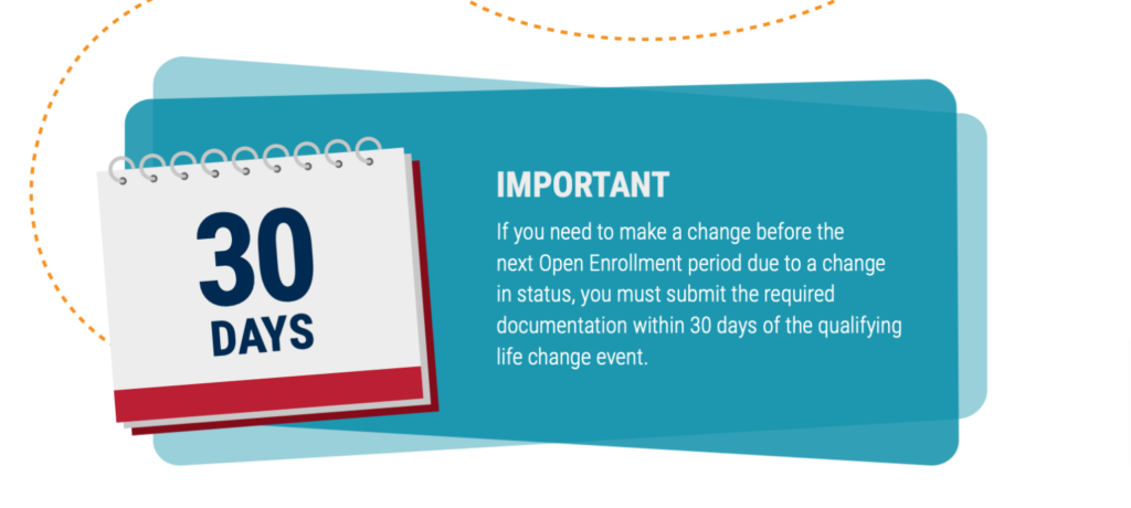
Callouts pull key passages from your benefits guide—like premium costs or enrollment deadlines—and embed them in the main text with larger fonts and visual signifiers such as underlining and bullet points. This ensures that your employees will absorb the most pressing details from your benefits guide, even if they skim quickly.
4. Illustrate Personas and Scenarios to Bring Benefits Decisions to Life
We can summarize this tip with two words: “Tell stories.” Not just with words, though, but with images and illustrations.
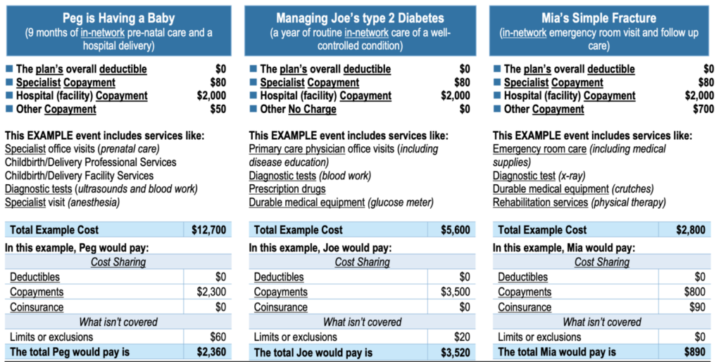
Whether drawn from your employees’ experiences (with their permission, of course) or fictionalized, illustrated scenarios can translate the abstract language of coverage and payments into real-life consequences.
For example, you might tell a story about Carla, a young employee who chose a particular health plan and had her first baby that year. You can show how Carla used her plan during each step of her pregnancy to pay for the care she needed.
You might also tell the tale of Roger, who is five years from retirement. Using pictures and text, you can show how Roger sets goals and allocates enough funds to his 401(k) to be ready when the big day comes.
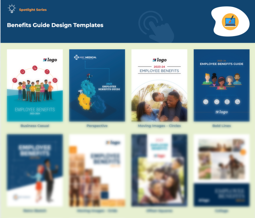
5. Give Your Benefits Guide a Premium Sheen with a Professionally Designed Template
Graphic design is an art and a science, and truly mastering design requires years of study and experience—not to mention a visually creative personality. As an HR professional, your interests and competencies lie elsewhere.
Fortunately, you don’t need to enroll in design school to create a visually appealing benefits guide.
How Flimp Helps
Providers like Flimp offer easy-to-use templates designed by experienced professionals to be transformed into navigable and informative benefits guides. Flimp’s templates include all the visual features listed in this article and many more built to highlight essential information and steer employees toward quick, satisfying decisions.
For a truly unique guide customized with your branding, colors, images, and benefits details, Flimp also offers full design services. Thanks to our design and content library, we can have your guide ready in as little as a week.
Start with a beautiful pre-made template or work with our expert designers from the ground up—the choice is yours. Click here to discuss how we can help your benefits guide stand out visually and, most importantly, drive a pleasant and informed open enrollment season for your employees.

